UI SYSTEMS
Building a complete interface system from the ground up.
WILDCARD · UI/UX Director · Product Design · Interaction · Motion
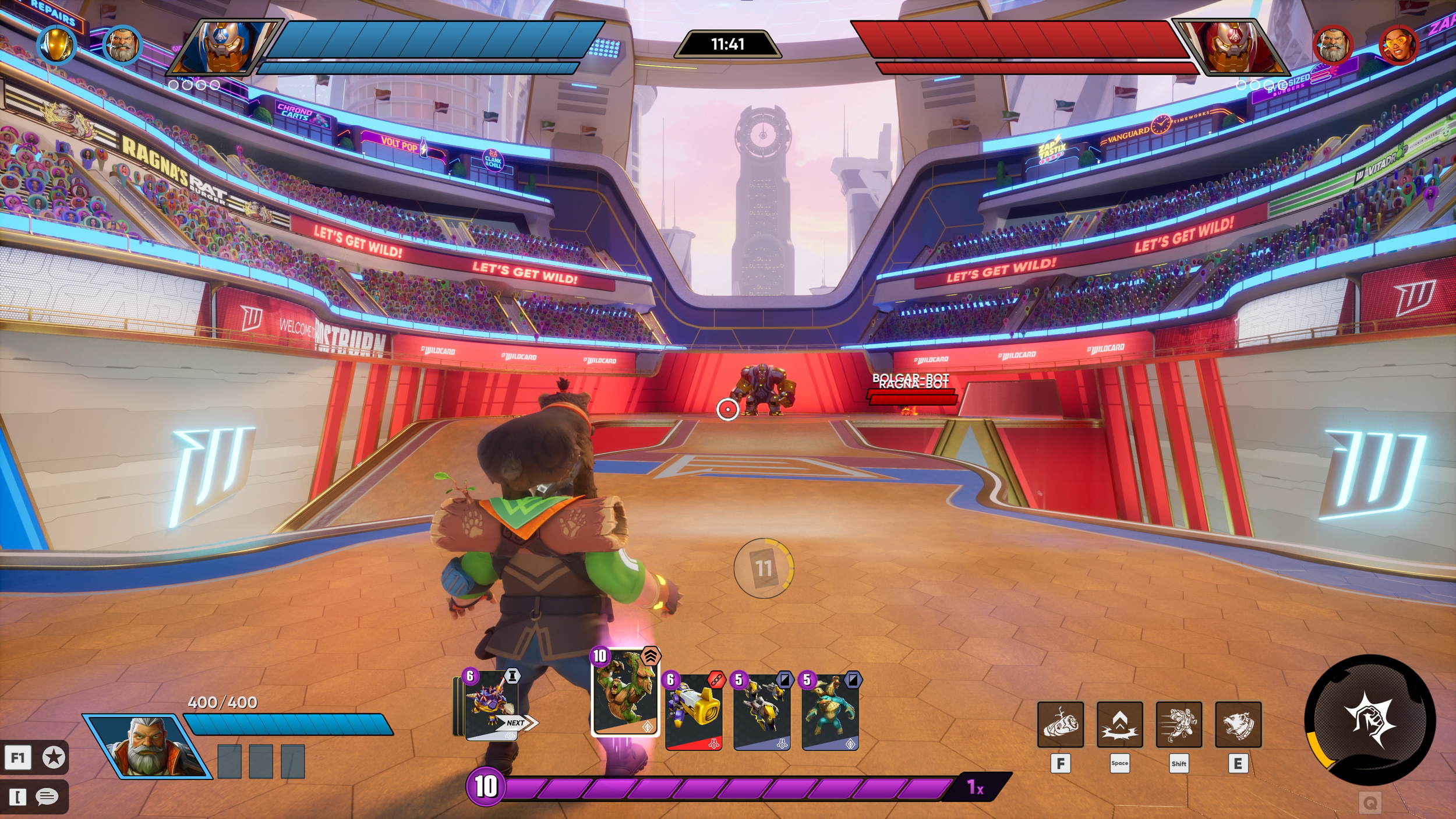
Designing a cohesive UI system for a complex multiplayer game—from information architecture and navigation to high-fidelity menus, HUD, interaction states, and in-engine implementation.
ROLE
UI/UX Director
SCOPE
UX Strategy · UI Systems · Visual Design · Motion · Implementation
TEAM
Design · Engineering · Production
PLATFORM
Unreal Engine
The Challenge
Building a UI system for a game that was still finding itself.
Wildcard evolved significantly throughout production, with new systems, features, and design directions continually changing the experience. The challenge was to create a UI system flexible enough to evolve with the game while maintaining a consistent visual language and intuitive interaction patterns.
I owned the UI/UX direction and was responsible for defining the creative vision, UX strategy, and execution of the game's interface systems.
My Approach
Structure
How does the player navigate?
Language
How does the interface look and communicate?
Components
How do individual UI elements behave?
Experience
How does everything work together in-game?
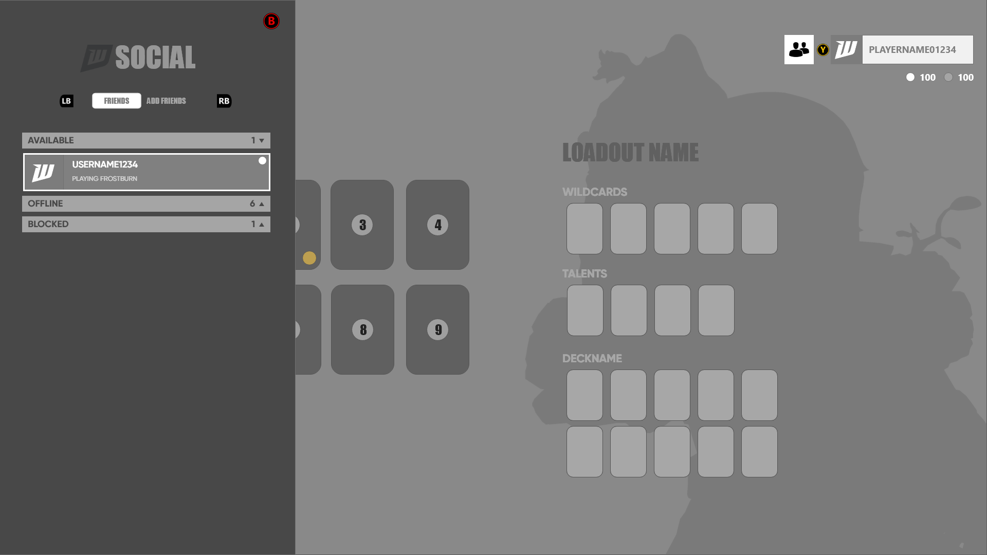
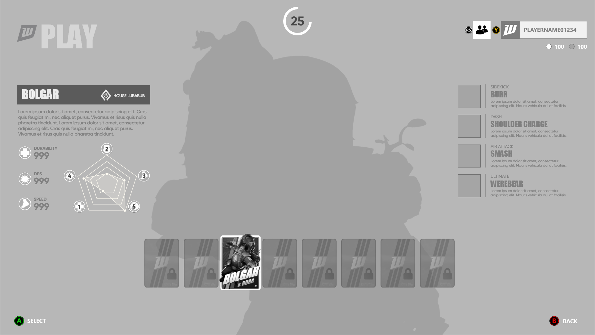
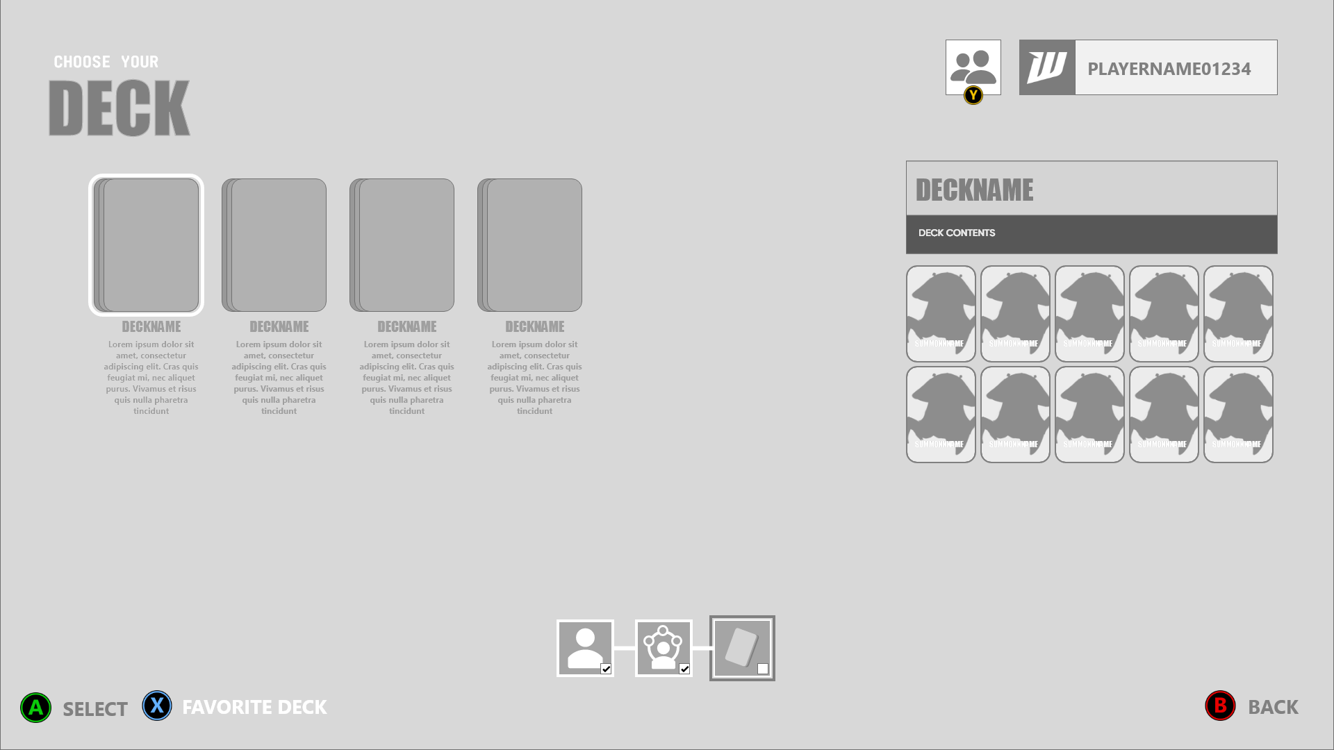
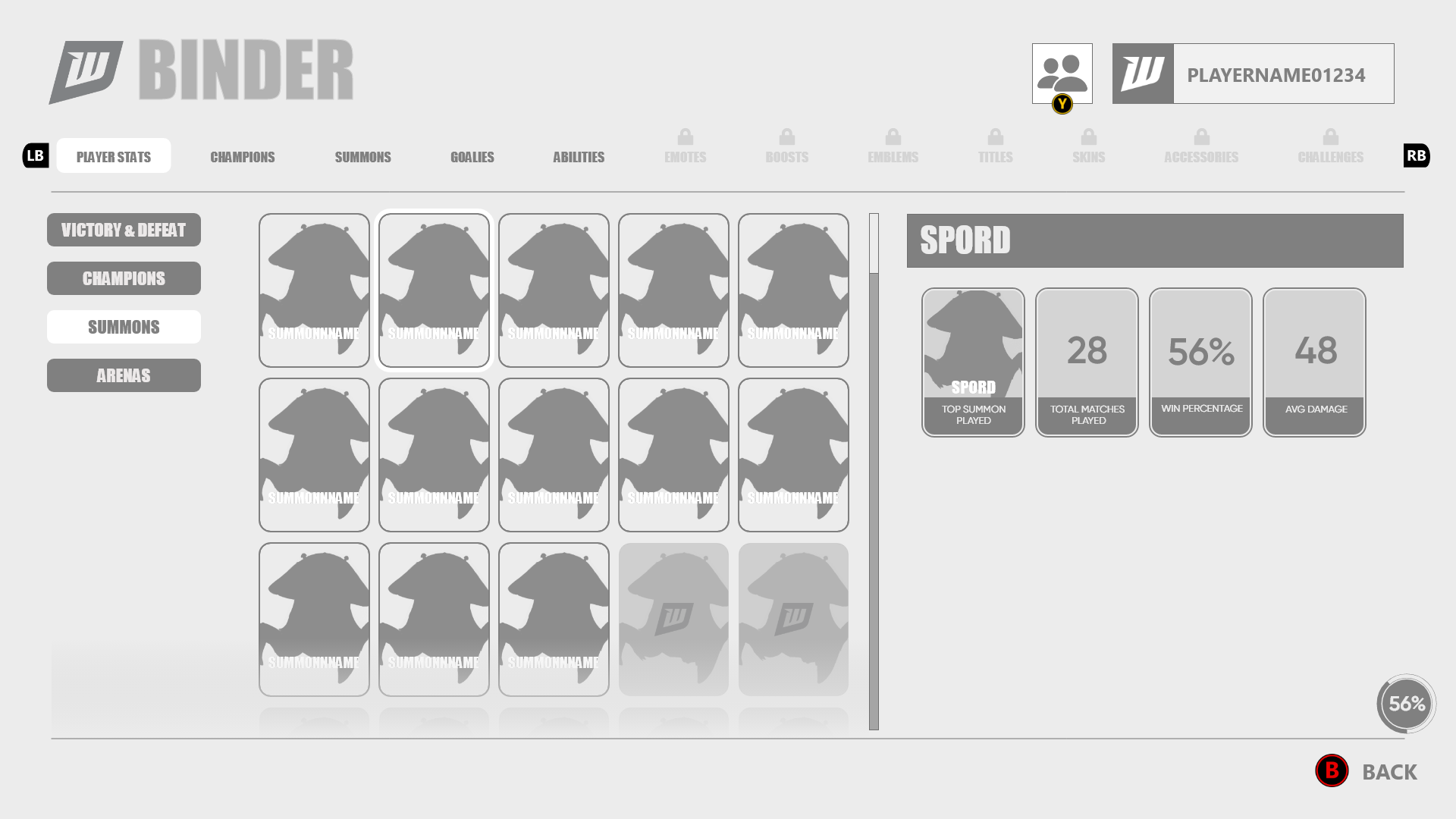
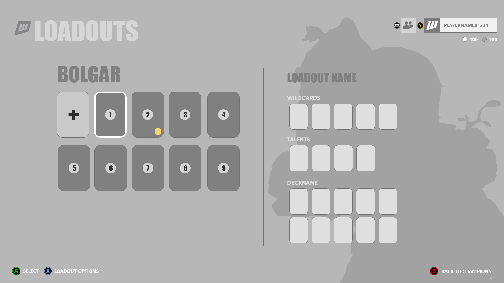
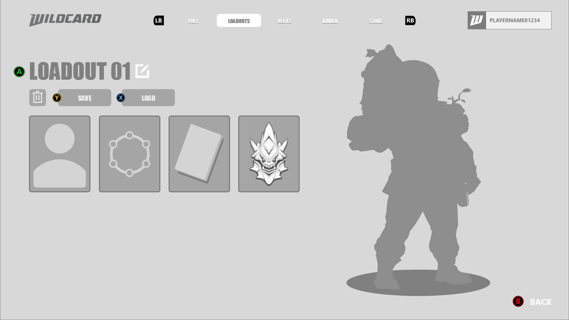
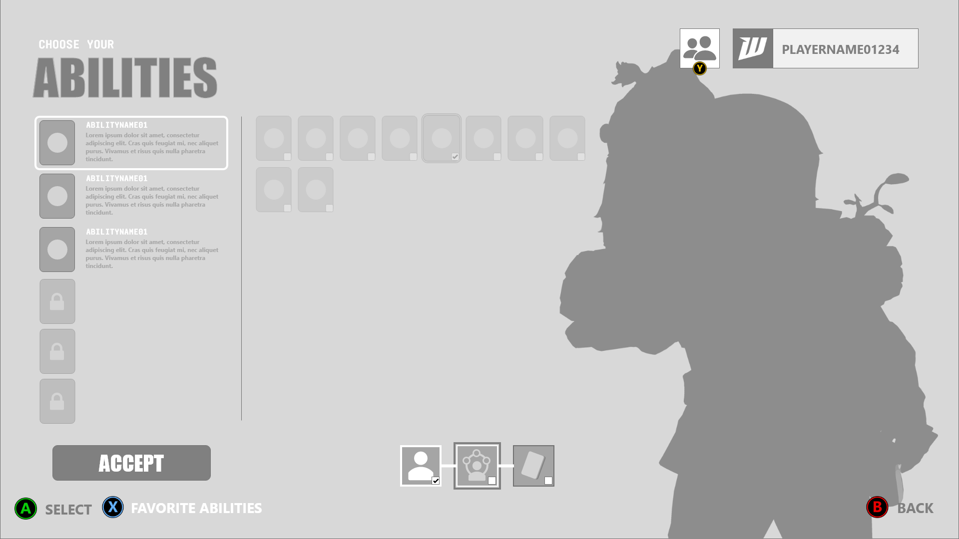
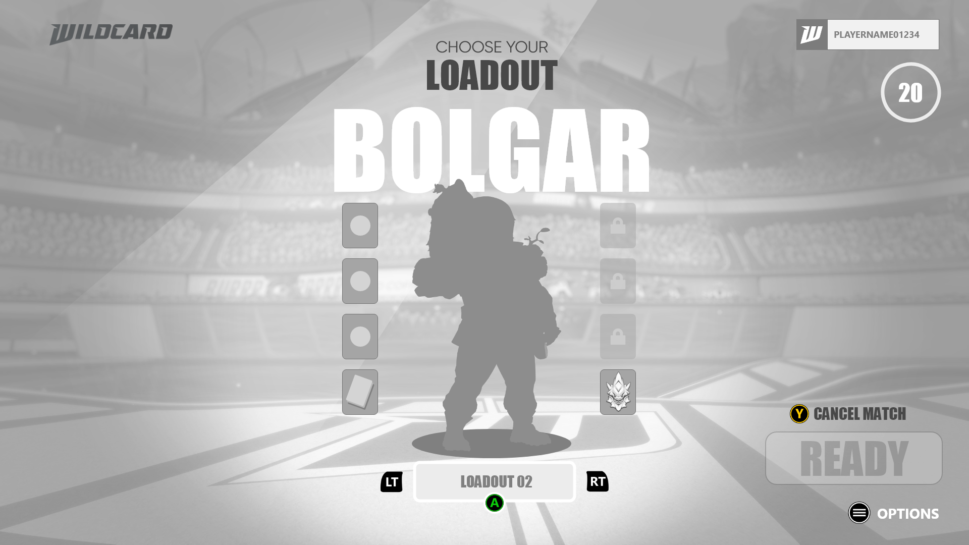
Wireframes & UX
Starting with structure.
Before establishing the final visual language, I worked through the underlying flows and information architecture of the experience. Wireframes allowed me to explore navigation, hierarchy, and interaction patterns before committing to visual design.
Building The Visual Language
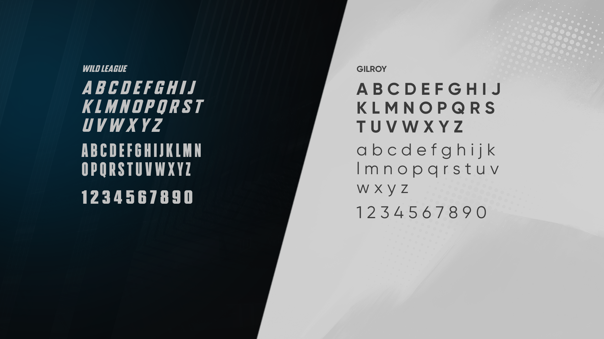
Typography
Typography was designed to balance readability with the futuristic, competitive tone of the game, creating a hierarchy that could scale across menus, gameplay information, and supporting systems.
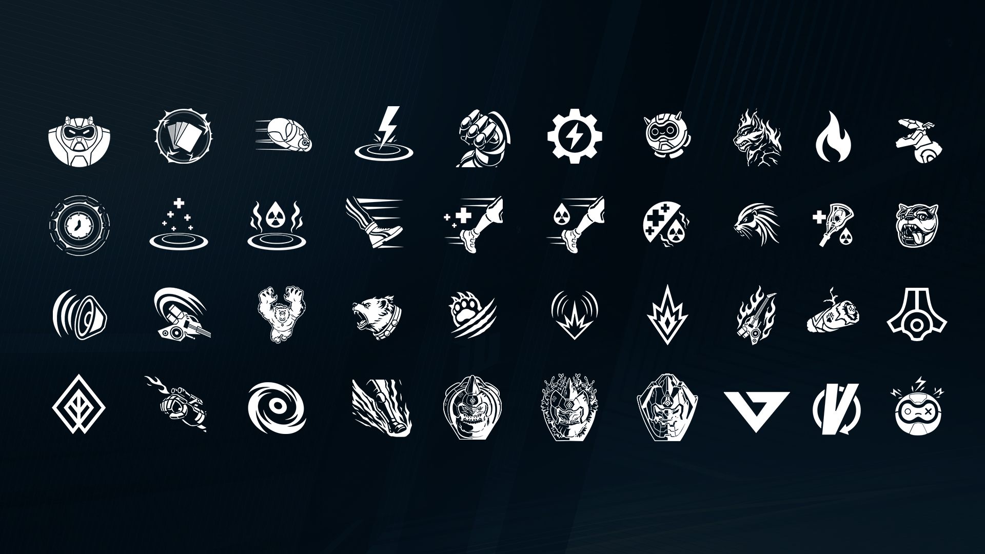
Iconography
Iconography was developed as a consistent visual language for abilities, equipment, navigation, and gameplay information, allowing complex systems to communicate quickly and consistently.
Navigation & Menus
Creating the Player’s Navigation System
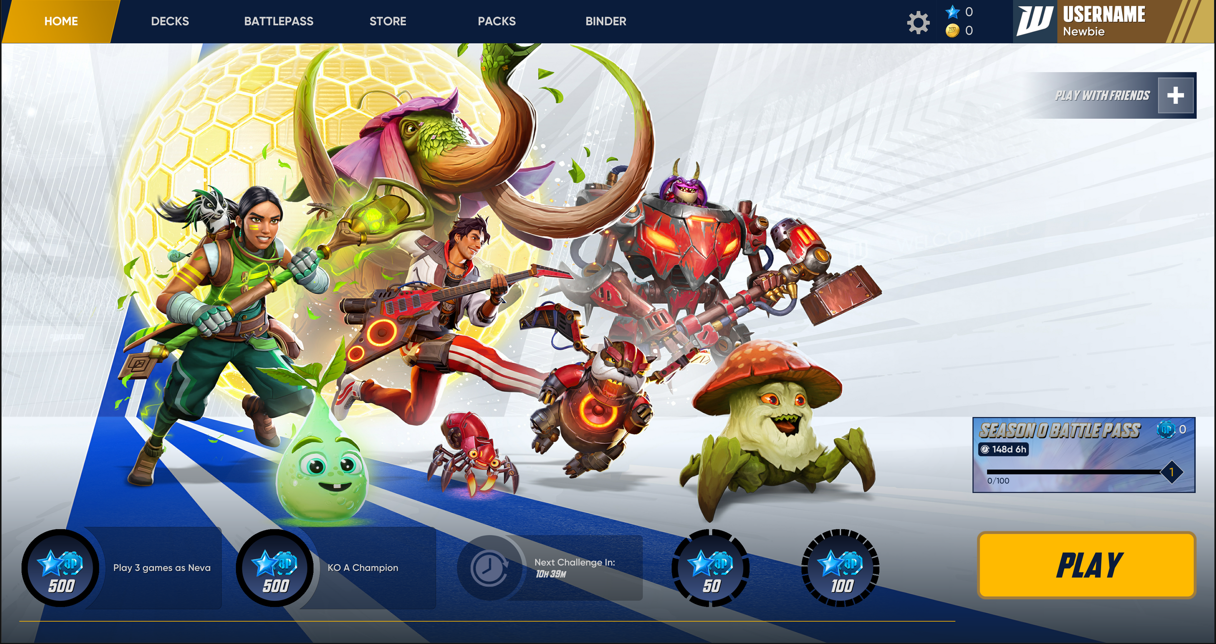
The main menu established the foundation for how players moved through the broader experience. From here, the interface needed to connect gameplay, collection, customization, social features, and progression without making the system feel overwhelming.
The Deckbuilder
Turning a complex collection system into an understandable player workflow.
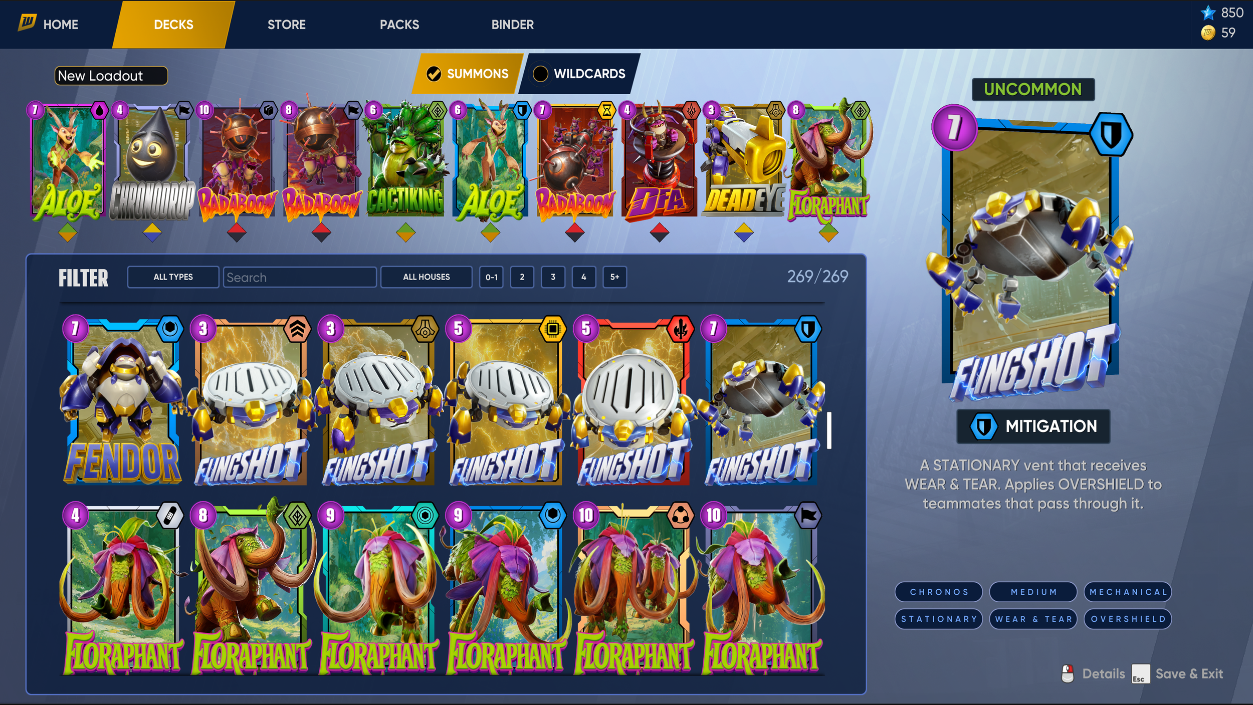
One of the more complex areas of the product was helping players manage the creatures they had collected and build decks they could take into gameplay.
Collection
Making a large amount of game information approachable.
The Workshop extended the player journey beyond simply acquiring items. Players could upgrade and craft traps, creating a system that needed to communicate both what they owned and how those items could evolve.
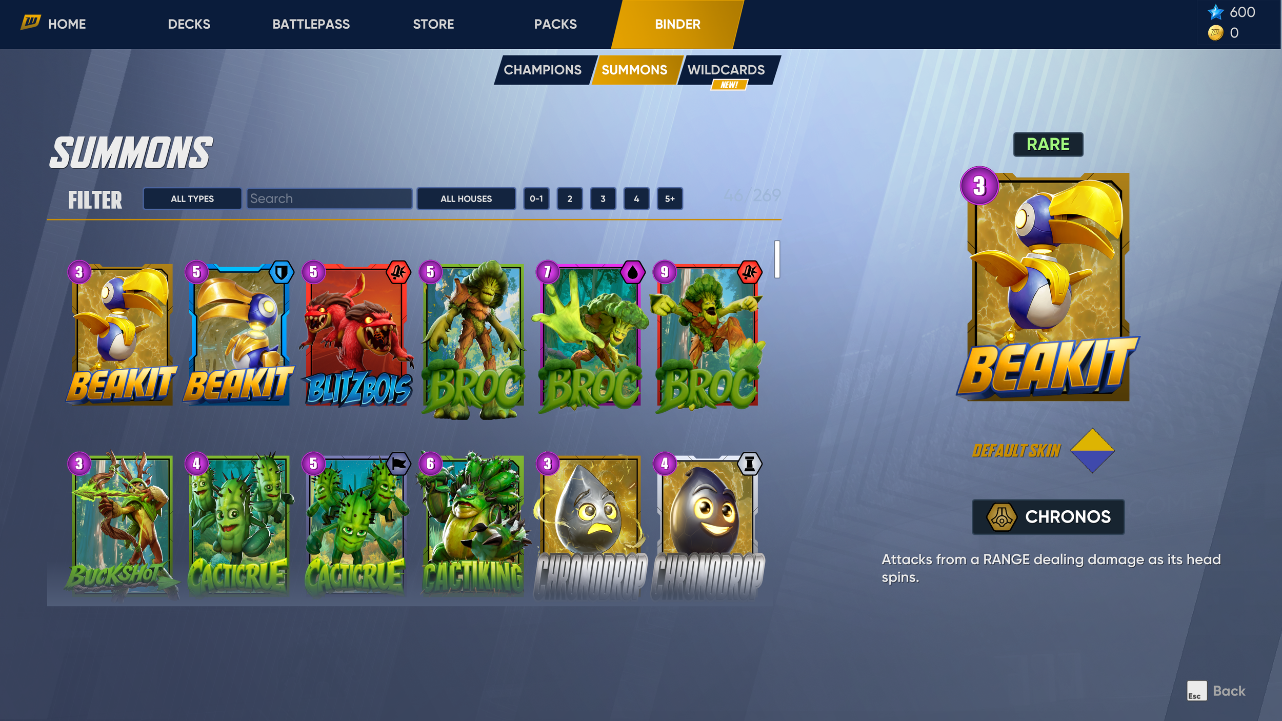
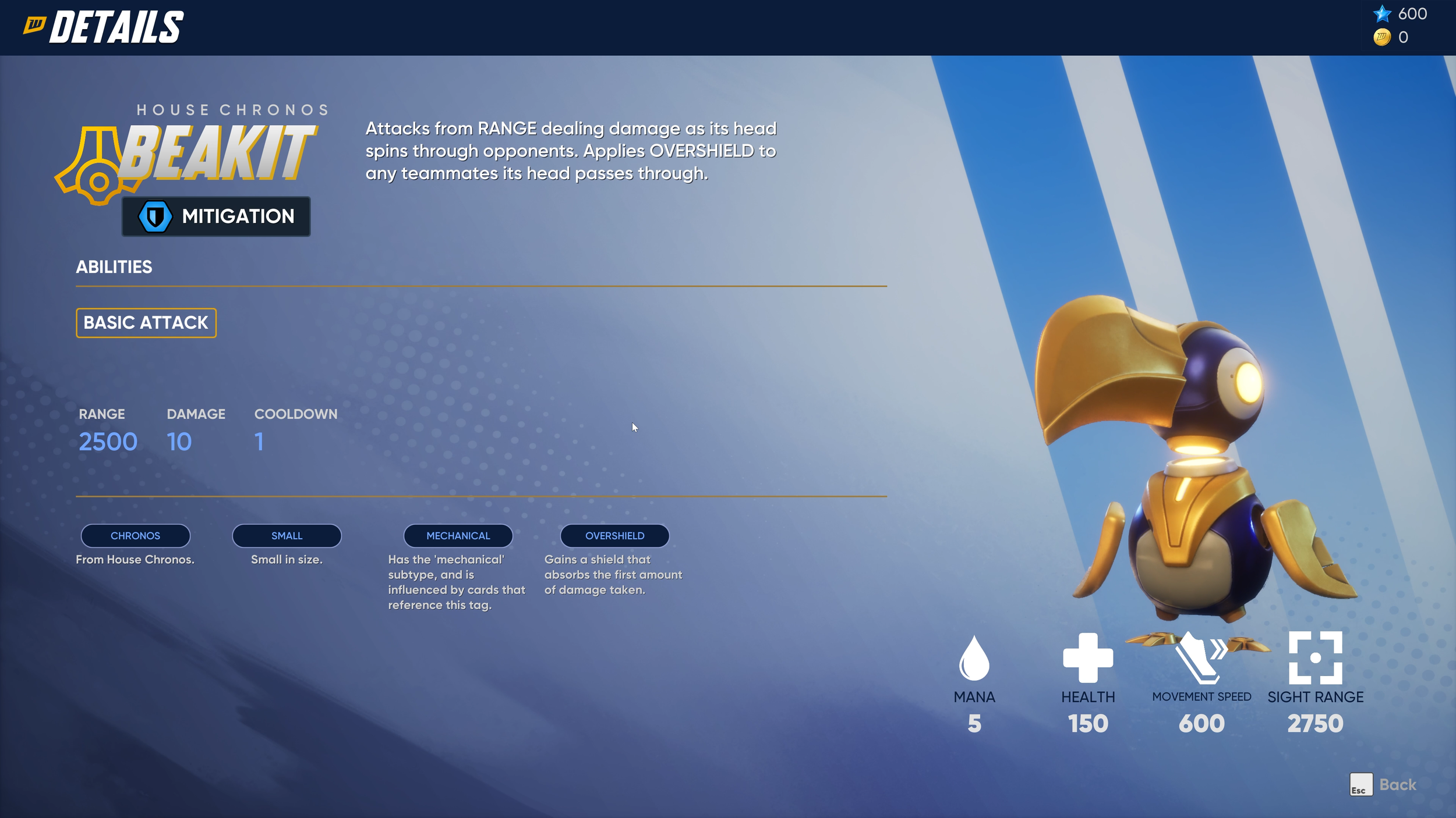
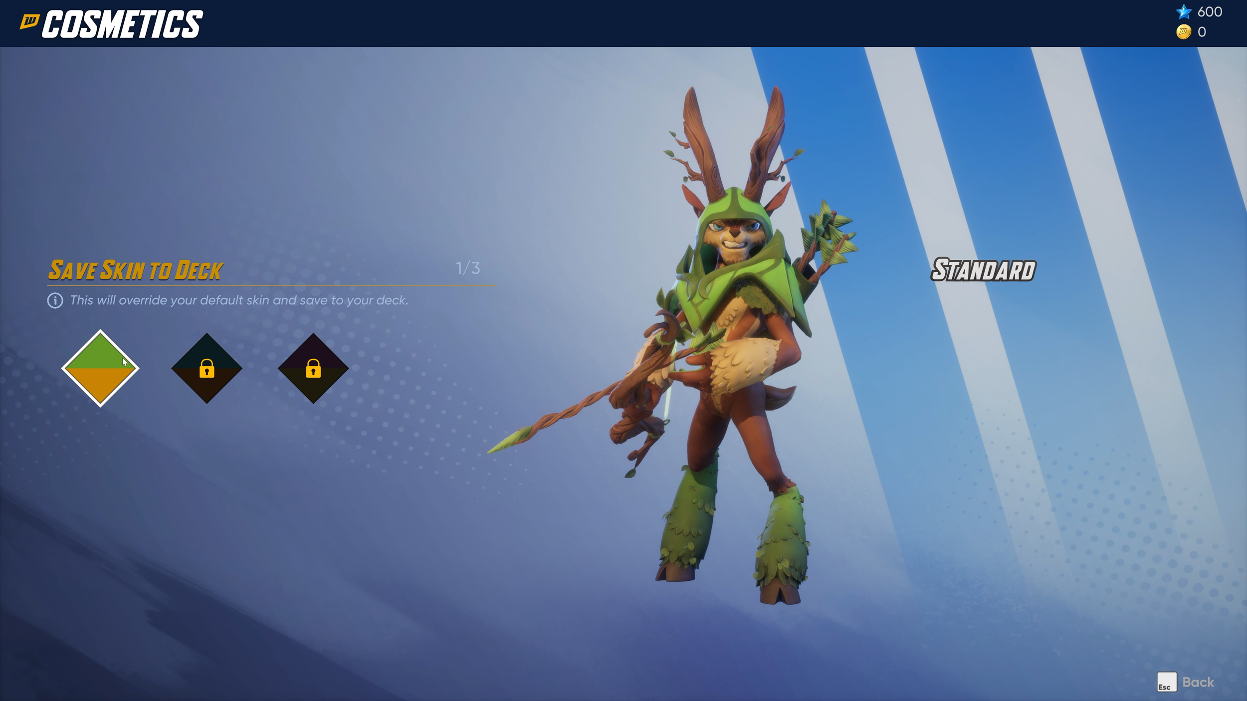
The collection experience needed to support discovery, inspection, and customization while keeping the information hierarchy understandable. Players could move from a broad collection view into detailed information without losing their place within the larger system.
Store & Pack Opening
From browsing to reward.
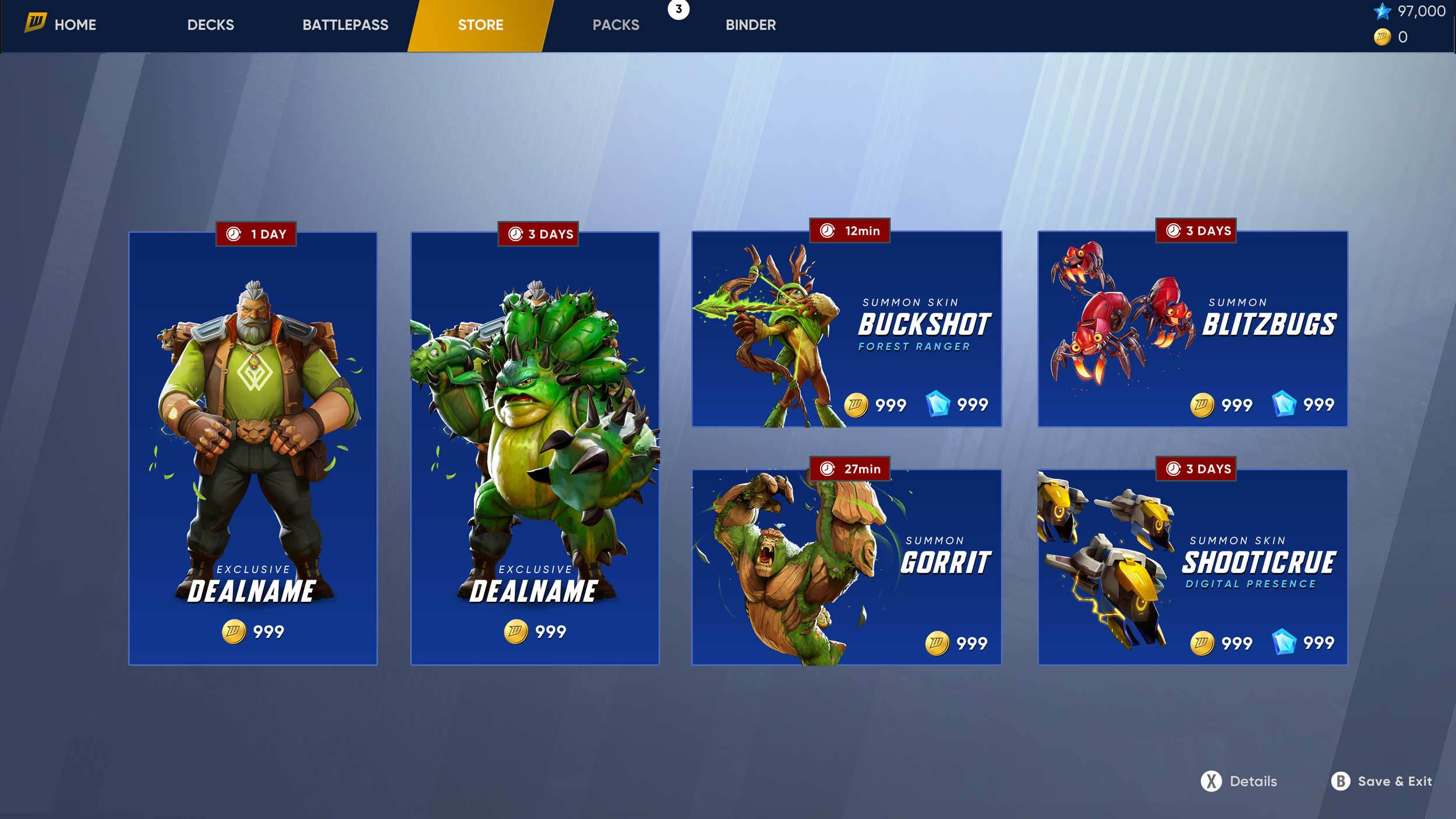
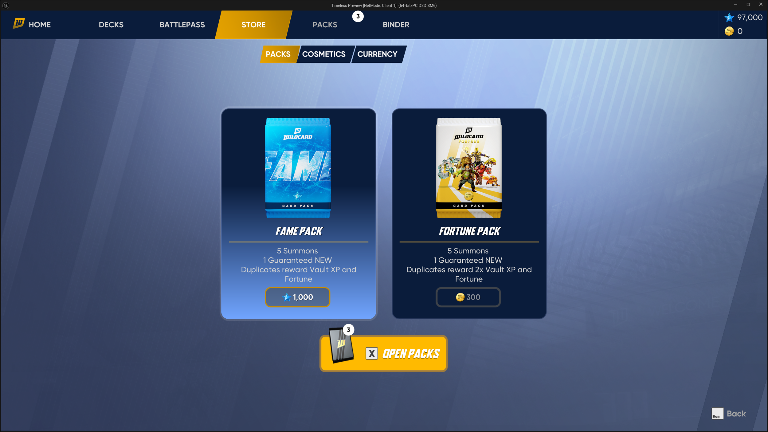
The Store connected the collection system to acquisition, giving players a clear path from discovering content to understanding and obtaining it.
Chest Opening
Designing anticipation into the reward experience.
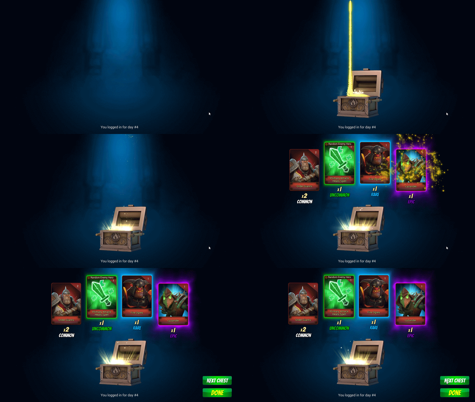
The chest opening sequence was designed as a moment of anticipation rather than simply a transactional reward screen.
Motion and reveal timing were used to build a sense of progression and make the contents of the chest feel meaningful.
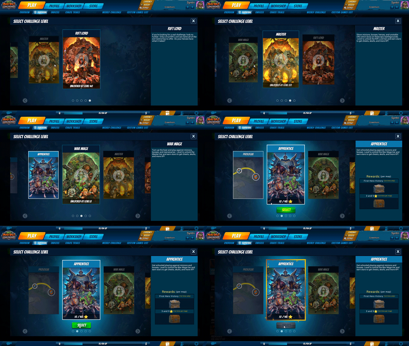
Survival Mode
Giving players control over the challenge.
Survival Mode required a simple way for players to define the experience they wanted to play. The interface needed to make difficulty and level selection understandable without adding unnecessary friction.
Systems, Not Screens
The challenge wasn't designing each screen independently. It was creating a consistent visual and interaction language that allowed players to move between systems without having to relearn how the interface worked.

The goal was to create a feedback loop between the people watching and the people playing—bridging the physical distance created by the screen.
From Design to Implementation
I worked directly with dashboard programmers to bring the interface into Unity, translating visual designs and animation into working interactive systems while collaborating on the underlying functionality.

Reflection
A player's experience is bigger than the game itself.
The most important part of this project was understanding that the player experience didn't begin when the match started.
Character selection, kit configuration, progression, crafting, acquisition, and mode selection all shaped how players approached the game.
My goal was to make those systems feel like parts of one cohesive experience—giving players the information and tools they needed to make decisions while keeping the path into gameplay clear and engaging.